
대회 : https://www.kaggle.com/competitions/acea-water-prediction
Acea Smart Water Analytics
Can you help preserve "blue gold" using data to predict water availability?
www.kaggle.com
노트북 : https://www.kaggle.com/code/muskanmulyan/forecasting-acea-smart-water-analytics
Forecasting Acea Smart Water Analytics
Explore and run machine learning code with Kaggle Notebooks | Using data from Acea Smart Water Analytics
www.kaggle.com
데이터셋

- 우선 해당 데이터셋은 5223 개의 row 와, 8개의 col 로 이루어져 있음
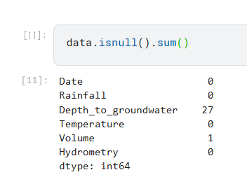
결측치 살펴보기
- isnull 인 거 각 col 별로 확인했을 때, 4개의 열의 갯수가 1024개로 똑같았음 -> 이거 없애주면 되겠다!
그런데 이게 완전히 겹치는지가 궁금해서 확인해봄
완전히 일치한다! 그래서 해당 row 들만 제거해주는 줄 알았는데... 해당 노트북에서는 그 col 들을 아예 삭제한다.
(이유는 경험상의 무언가이지 않을까 추측함, 나중에 시간되면 row 제거한걸로 전처리해서 해볼 생각)
결과적으로, 준비한 데이터는 아래와 같다.
X : Date, Rainfall, Temperature, Volume, Hydrometry 라는 features
y : Depth_to_groundwater 라는 targert
결측치 처리를 위한 시각화
여기서 의문인 점 : 앞에서는 fatures 와 target 을 나눠놓고 다시 data 로 돌아왔다.
x 축인 Date 에 따라, y 축의 Rainfall, Depth_to_groundwater, Temperature, Volume, Hydrometry 에 대한 분포를 살펴보았다. (순서대로 1, 2, 3, 4, 5)
- 1 : 무난한듯...? 튀는 부분이 outliner 일 수도 있다.
- 2 : 2013 년도에 갑작스럽게 내려간 부분이 있다.
- 3 : 1년 주기로 규칙적인 듯함
- 4 : 마찬가지로 튀는 부분이 outliner 일 수 있다.
- 5 : 2015년도는 값이 측정이 안된듯하다.
그리고 나서 pair plot 이라는 걸 했는데...
이때 sns.pairplot 이란,
- 데이터셋에 쌍별 관계를 표시하는 함수
- 기본적으로 이 함수는 데이터의 각 숫자 변수가 단일 행의 y축과 단일 열의 x축에 걸쳐 공유되도록 axis grid를 생성함
- diagnoal plots 은 서로 다르게 다뤄짐
- 각 열의 데이터의 주변 분포를 보여주기 위해 a univariate distribution plot (단변량 분포도)단변량 분포도가 그려짐
- 변수의 하위 집합을 표시하거나 행과 열에 다른 변수를 표시하는 것도 가능함
매개변수
data : 각 col은 변수이고 각 row은 observation 인 panda.DataFrame Tidy (장형) 데이터프레임

아직 이건 뭔지 잘 모르겠다. 아무튼 각 feature 간의 상관 관계를 보여줄 수 있다.
아 그리고 추가적인 전처리!
feature 중에 date 가 있는데, 이게 간격이 어떻게 되는지를... 모른다. 그래서 해당 노트북에서 체크해봤는데, 간격이 다 하루씩 차이라서 재샘플링 안했다. 만약 interval 이 일정하지 않다면, 재샘플링이 필요하다고 하다
(이런 경우 어떻게 재샘플링해주면 될지 궁금함... 이라고 썼는데 뒤에서 해줌)
아무튼 추가적인 재샘플링은 패스하고 data 를 살펴봤는데... 아까와는 다르다.
왜냐면 lineplot 을 할 때, 아무래도 na 가 있으면 안되니깐, fillna(method='ffill') 을 이용해서 결측치를 채워졌기 때문이다.
df.fillna(value=None, method=None, axis=None, inplace=False, limit=None, downcast=None)
value : 결측값을 대체할 값입니다. dict형태로도 가능합니다.
method : 결측값을 변경할 방식입니다. bfill로 할경우 결측값을 바로 아래 값과 동일하게 변경합니다.
ffill로 할 경우 결측값을 바로 위 값과 동일하게 변경합니다.
axis : {0 : index / 1 : columns} fillna 메서드를 적용할 레이블입니다.
inplace : 원본을 변경할지 여부입니다. True일 경우 원본을 변경하게 됩니다.
limit : 결측값을 변경할 횟수입니다. 위에서부터 limit로 지정된 갯수만큼만 변경합니다.
downcast : 다운캐스트할지 여부입니다. downcast='infer'일 경우 float64를 int64로 변경합니다.
이런식으로 사용할 수 있다.

이후 0은 null 로 대체해주었다. (둘 다 분포를 봤을 때 일반적인 값은 아니니깐...)
이때 0은 그래도 숫자인데, 굳이 null 로 대체할 필요가 있나? 싶었는데 아래 시각화를 위한거였다.

msno.matrix 는 결측치의 분포를 시각화하는 함수라고 한다.
저기 하얀 부분이 결측치인 NaN 이 있는 부분이다.
결측치 처리하기
이때, 결측치를 처리하는 방법은 크게 4가지가 있다고 한다.
1. 고정된 값으로 채우기 : Nan 값을 고정된 값으로 바꾸기(예: 0 또는 np.inf)
2. 평균 또는 중앙값으로 채우기: Nan 값을 열의 평균 또는 중앙값으로 대체
3. Fill 메서드를 사용하여 채우기: Fill 메서드는 Nan 값을 마지막 값으로 대체
4. interpolated value(보간값)로 채우기: 보간은 선형, 다항식, 최근접 등이 될 수 있음. 주변 인덱스 값을 고려하여 채움
- ex. 선형 보간 값은 동일한 간격으로 계산되어 채워진다.
Volume 에 대해 4가지 방법으로 결측치 처리를 해보자.


- 개인적으로 linear interpolation 이 가장 괜찮은듯...? 일반적으로 interpolation 방법 사용하는 거 많이 봤음

그래서 이 방식으로 다른 cols 들도 적용해줬다.
데이터 Smoothing / Resampling 방법
Time series 데이터에서, Smoothing / reesampling 에는 data frequency 를 조정하는 것도 포함된다.
- Upsampling : 샘플 빈도가 증가할 때 (예: 며칠 -> 몇 시간)
- Downsampling : 샘플 빈도가 감소할 때 (예: 며칠에서 몇 주)
- Resampling for Irregular data : 불규칙 데이터를 정규 간격으로 변환합니다
- Rolling statistics : 전체 데이터 세트에 대해 단일 통계를 계산하는 대신, 우리는 해당 데이터의 하위 집합이나 창에 대해 롤링 통계를 계산하고, 새로운 데이터 포인트를 만날 때마다 창을 조정합니다 (예: 창을 10일로 설정하고, 평균을 계산하고, 창을 계속 미끄러뜨리며 곡선을 형성합니다)
- Moving averagees : 슬라이딩 창에서 값을 평균화하여 데이터를 매끄럽게 만듭니다
- Exponential smoothning : 이전 데이터에 지수적으로 감소하는 가중치를 할당합니다
- Decomposition and Trend analysis : 데이터를 trend, seasonality, residuals 으로 나누어 더 나은 모델링을 제공합니다
그래서 day, week, month 로 리샘플링해서 시각화해보았다.


이때, weekly 가 분석에 도움될거라 판단하여 이후는 이렇게 진행된다.

Stationary (정상성) 이란 무엇인가?
ARIMA 와 같은 time-series 모델은 data 가 stationary 하다고 가정한다.
* ARIMA : Autoregressive Integrated Moving Average
- time series data 의 future values 를 analyze 하고 forecast 하기 위해 과거 observations 간의 relation 을 leveraging 하고, non-stationarity 를 처리하기 위해 concept of differencing을 통합하고, current values 에 대한 past errors 의 impact 를 고려하는 통계적 방법. 즉, 데이터의 과거 패턴을 기반으로 미래의 trends 를 예측하는 방법임.
Stationary 한 데이터는, 아래의 조건을 만족한다.
* constant mean 과 mean 은 time-dependent 하지 않다.
* constant variance 과 variance 은 time-dependent 하지 않다.
* constant covariance 과 covariance 은 time-dependent 하지 않다.
Staionary 를 체크하는 3가지 방법
1. Visual : time series 를 plot 하고, stationarity 를 위한 trends 를 체크한다.
2. Basic Statistics : time series 를 split 하고, 각 partition 에 대한 mean 과 variance 를 비교한다.
3. Statistical test : Augmented Dickey Fuller test (이게 머임?)
1. Visual


4. ADF
Unit root test 라는 통계적인 test 가 있고, 그 중 한 유형이 ADF 라고 한다.
Unit roots 라는게, non-stationarity 의 cause 라고 함. 아무튼 이 테스트를 이용해서 Stationarity 체크 가능
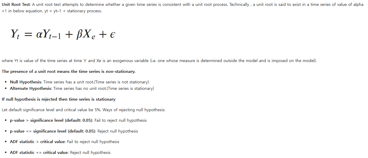
adfuller 함수가 ADF 를 수행한다고 한다.


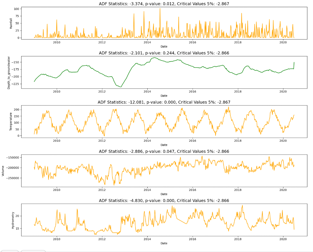
오렌지색은 stationary 하고, 초록색은 not stationary 하다. 즉, Depth_to_groundwater 에 대해 stationary 하게 바꿔줘야한다.
Stationary 하게 만드는 방법
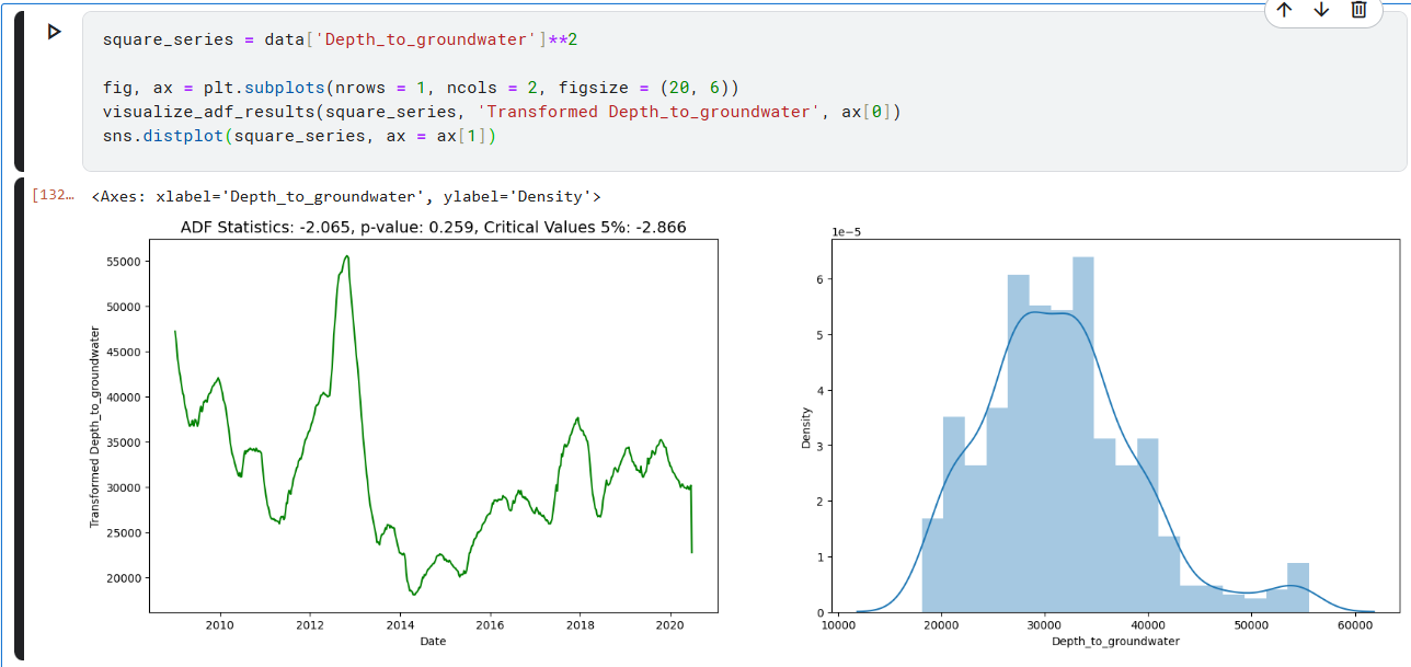
1. Transformation : log 나 제곱근을 사용해서, non-constant variance 를 안정화시킨다.
2. Differencing : 이전값에서 현재값을 뺀다. 1차, 2차... n차가 될 수 있음
1. Transformation - log

1. Transformation - 제곱근
2. Differencing - 1차

EDA
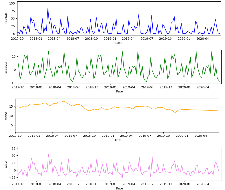
Time Series Decompositon (시계열 분해)
a series 를 level, trend, seasonality, noise components 의 combination 으로 생각하는 것
- Level : 평균값
- Trend : 값이 증가 or 감소 하는 추세
- Seasonality : 짧은 단기 사이클로 반복되는 것
- Noise : random variation
Components 가 combination 되는 방법
Additive (덧셈) : y(t) = Level + Trend + Seasonlaity + Noise
Multiplicative (곱셈) : y(t) = Level * Trend * Seasonality * Noise
seasonal_decompose 는, a time series 를 세 가지 component 의 sum 또는 product 로 나타내기 위한, time series analysis 를 위한 method 이다.
이때 세 가지 component 란, linear trend, periodic (seasonal) component, random residuals 를 뜻한다.
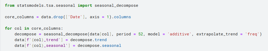


features 에 대한 individual 한 decomposition (이렇게 할 수도 있다!)

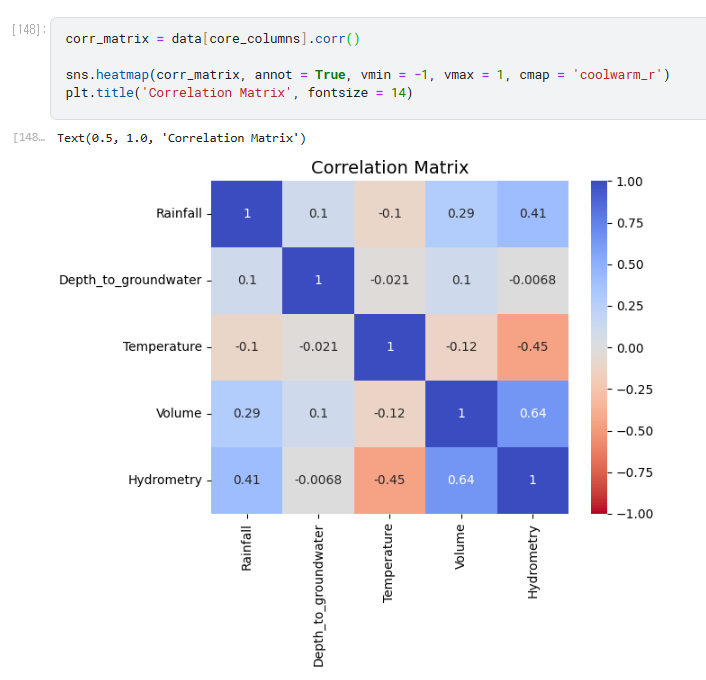
Correlation Matrix
Autocorrelation Analysis
Autocorrelation 이란, a time series 에서의 different points 의 two observations 간의 correlation 을 뜻한다.
Autocorrelation(ACF) 와 Partial Autocorrelation(PACF)는, Time series 데이터셋의 patterns 와 dependecies 를 이해하고 분석하기 위해 사용되는 statistical tools 이다. serial correlation 의 존재를 인식하는 것을 도와준다. 이때, serial correlation 이란, time series 와 그것의 lagged version, 즉 지연된 버전 (이전 시점) 간의 상관 관계를 뜻한다.
Autocorrelation Function (ACF) :
- 정의 : ACF measures the correlation between a time series and its lagged values at different time intervals.
- 목적 : It helps to identify the underlying patterns or trends in the time series. A strong autocorrelation at a particular lag indicates that the current value of the time series depends on its past values up to that lag.
- 설명:
If ACF at lag 1 is high, it suggests a strong linear relationship between the current value and the previous value.
If ACF shows periodicity (e.g., every 12 lags), it might indicate a seasonal pattern in the data.
If ACF drops off quickly after a few lags, it suggests that most of the information in the series is contained within those lags.
Partial Autocorrelation Function (PACF):
- 정의 : PACF measures the correlation between a time series and its lagged values after removing the linear dependence of the series on the intervening lags.
- 목적 : PACF helps in identifying the order of an autoregressive (AR) model. An AR model represents the current value as a linear combination of its past values. PACF helps to identify the number of past values that directly influence the current value, effectively showing the "pure" correlation.
- 설명 :
A significant PACF value at lag k indicates that there's a direct relationship between the current value and the value k time units ago.
Non-significant PACF values at lags beyond the identified order suggest that those lags do not contribute significantly to predicting the current value.
아무튼 이런게 있고... 이걸 이용해 분석을 할 수 있다.
pandas

statmodels

Time series 데이터의 유형 2가지
Univariate : time series 가 단 하나의 time-dependent variable 를 갖는다.
Multivariate : time series 가 여러 개의 time-dependent variable 를 갖는다.
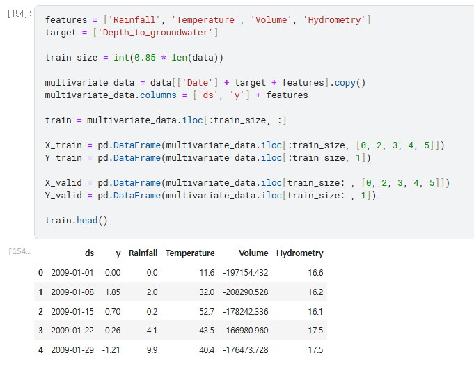
그냥 원래 데이터 이용해서 multivariate 데이터 만든거임
Prophet 모델
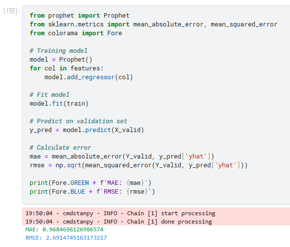
Prophet 이라는 걸 이용해서 model 만드는건 처음 보는데... Facebook 에서 만든 Time series 예측 라이브러리라고 함

Lesson learned
- 결측치 처리 방식 (살펴보고, 시각화하고, 처리해주기)
- Smoothing / Resampling (+ Time series 에서는 data frequency 조정 포함)
- Stationarity 체크 → Stationary 하게 만들기 (Transformation, Differencing)
- EDA : Time Series Decomposition, Correlation 등을 이용한 분석
- Prophet 으로 Time series 예측 간단하게 가능
참고
https://pandas.pydata.org/docs/reference/api/pandas.DataFrame.fillna.html
pandas.DataFrame.fillna — pandas 2.2.3 documentation
If method is specified, this is the maximum number of consecutive NaN values to forward/backward fill. In other words, if there is a gap with more than this number of consecutive NaNs, it will only be partially filled. If method is not specified, this is t
pandas.pydata.org
06-04. 결측값 변경 (fillna / backfill / bfill / pad / ffill)
####DataFrame.fillna(value=None, method=None, axis=None, inplace=False, limit=None, downcast=None) …
wikidocs.net
나중에 참고
https://spureconomics.com/interpreting-acf-and-pacf-plots/#google_vignette
https://machinelearningmastery.com/time-series-forecasting-methods-in-python-cheat-sheet/